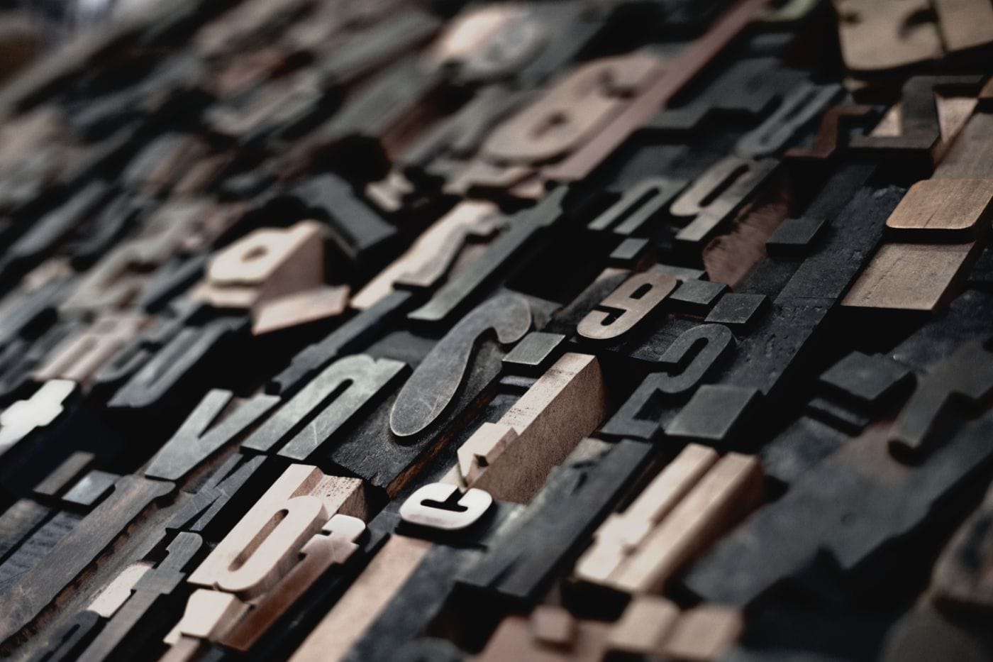


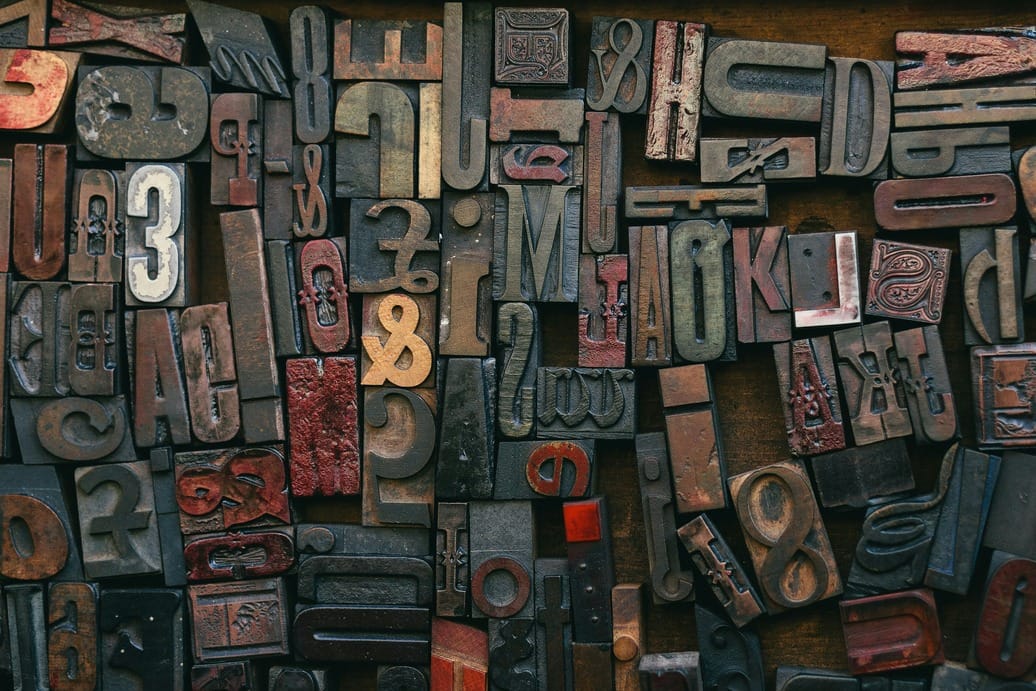
Typography is more than just choosing a font—it’s the art of arranging text in a way that enhances readability, communicates tone, and creates a visual hierarchy. Great typography can transform an ordinary design into something memorable, guiding the reader’s eye and reinforcing your message.
Good typography isn’t just aesthetic—it directly impacts how easily users can read and understand your content. Poor typography can drive readers away, no matter how great your message is.
From classic serif fonts that evoke tradition and trust, to clean sans-serifs that feel modern and minimal, every typographic choice plays a role in how your content is perceived. Spacing, line height, font pairing, and alignment all work together to create a seamless reading experience.


In today’s digital world, where attention spans are short, well-crafted typography can make the difference between a reader staying or leaving. By understanding the principles of contrast, consistency, and clarity, you can elevate your design and make your content truly stand out.
Overusing decorative fonts, inconsistent spacing, and poor contrast are some of the most common typography mistakes that hurt user experience.